
Thursday, 2 May 2013
Flat Plan
Contact Sheet and Photoshoot documents
Front Page

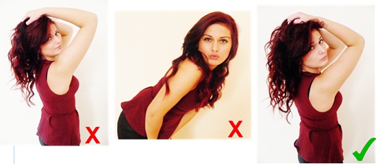
This shows here that the first three images aren't high quality, or in focus, so therefore these images were not suitable for my magazine. There was also a fact of these three top images had no meaning behind them, such as the theories of Male Gaze, Hyperreality, and Maslow's Hiearachy of needs. However, with the images shown that I have selected, shows that they all have meaning behind them. They include meaning such as the character is seen to be wild, crazy, and has a outgoing personality. This meets my target audiences wants and needs, as research from my survey proves they are wild, outgoing and crazy. However, the top of my first selected image was slightly cut out, so therefore i had used another image which is shown next to this, where i had combined the two images together, using the top of the head of the second image, to complete the first image. My results are shown in my last photo, which has all been done through my use of Photoshop.
Contents Page

This shows that I haven't used the four photos above, due to the fact that they are in not in focus, and the fact they do not convey any of the theories I intended to include, in particular the Male Gaze. There is also the fact of I wanted the image to convey a sense of power, so therefore my selected image shows this presentation, which is reasons as to why I had used this.


This here is showing another photo-shoot I had taken out of another couple to go on my contents page. However, this shows that I haven't used my first five images, due to the fact I feel they do not convey the sense of ‘love’ as much as I intended. In order to be appropriate for my demographic, I intended on taking a simple picture, that are appropriate for young females, where they are able to represent themselves. Therefore, the last image shows a simple and appropriate sense of ‘love’, that I have included within my magazine, that I feel was in focus, appropriate, and appealing to my target audience.

This shows the image I have used for my main person within my magazine page. However, I intended on using a basic image, that would show to the audience that the article based on her consists within the next few pages. However, the first few images show that the model shows no face expressions. There was also a fact of the image is not in focus, along with the image coming out to orange. However, my selected image shows a good sense of focus, and has also been taken in a good colour, which also conveys a sense of my theories, such as the Male Gaze, and Maslow's Hierarchy of Needs.
Double page spread
This is showing the my main image for my double page spread. For this page, I intended on using an image that would convey a sense of all my theories, in particular Maslow's Hierarchy of Needs. However, my first two image I feel was out of focus, and seen as too bright. They also show come across a bit childish for my demographic. However, whereas for my last image, this presents a great sense of the Male Gaze, and something where I am able to add in the Hyperreality effect, and is in much more focus, and high quality.

This however, is showing a picture of a small image I had added onto my double page spread, above my title. I intended on representing this image as a small stereotype of women, which is to be in line with the Male Gaze. However, I felt my first three images did not meet this need, due to the fact they were slightly out of focus, and due to incorrect fact expressions. Whereas for my selected image, I had chosen this due to the fact it shows a sense of the Male Gaze, which is appealing to my audience, which shows a sense of me using the correct mode of address.

This here is showing an image that contains on my double page spread, at the bottom of my article. Reasons as to why I hadn't used the top two images, was due to the fact that they do not relate to my target audience, and would not appeal to them. There was also a fact of there was a slight colour issue. One had appeared to bright, and the other I felt appeared to dark. However, my selected image shows that this is appropriate for my target audience, due to the fact they contain all theories, such as Maslow’s hierarchy of Needs, Hyperreality effect, and allows me to include a sense of the hyper reality effect, whereas for my other images, this may have been slightly harder to do.
Image Page

These images consist to be on my image page. However, I wished to have three of these, which would show my knowledge and use of all the theories; Hyperreality, Maslow's hierarchy of needs, and male gaze. However I felt that my first three images did not meet these needs, due to the fact some were slightly out of focus, and had shown no face expression, and were not powerful enough, due to their simple poses. Where as my selected images, show excellent use of the theories, and shows that they are quite powerful and interesting images, which would appeal to my audience.
This is a documents explaining where my photo shoot took place, the time, and the people that took part. If there were to be any health problems, the nearest hospital to these locations were Northwick Park Hospital. The details are as followed:
Address: Watford Rd, Harrow, Middlesex HA1 3UJ
Phone:020 8864 3232
The details of my models are:
Daniella Cooper
Health Problems: None
Email: daniella_c@hotmail.co.uk
Location: A House
Priyanka Chandarana
Health Problems: None
Email: pric@hotmail.co.uk
Location: School Photography room
Dilan Patel
Health Problems: None
Email: DilanP@hotmail.co.uk
Location: School Photography room
Mashal Zamani
Health Problems: None
Email: MashalZ@hotmail.co.uk
Location: School Photography room
Julia Boguszewska
Health Problems: None
Email: Julia_B@hotmail.co.uk
Location: School Photography room
Jack Cox
Health Problems: None
Email: Jack_c@hotmail.co.uk
Location: School Photography room
Patrycja Anna Lis
Health Problems: None
Email: Patalis@hotmail.co.uk
Location: School Photography room
7. Looking back at your preliminary task, what do you feel you have learnt in the progression from it to the full product?
 When comparing my preliminary task compared with my full
product, I can notice a huge difference. I can see the preliminary task is seen
as less professional looking and lacks the majority of the usual codes and
conventions. I had also lacked containing a vital convention, which is
including theories within my images. This was due to the fact I hadn't learnt
it during the production of creating my preliminary task. It also reinforces
the differentiations, due to the fact I hadn't planned my preliminary tasked,
nor based it on any research I had conducted, which is what had done throughout
my full product.
When comparing my preliminary task compared with my full
product, I can notice a huge difference. I can see the preliminary task is seen
as less professional looking and lacks the majority of the usual codes and
conventions. I had also lacked containing a vital convention, which is
including theories within my images. This was due to the fact I hadn't learnt
it during the production of creating my preliminary task. It also reinforces
the differentiations, due to the fact I hadn't planned my preliminary tasked,
nor based it on any research I had conducted, which is what had done throughout
my full product.  After fully learning the different concepts needed to meet
the codes and conventions, and knowing the different theories, such as Maslow’s
Hierarchy of needs, The Hyperreality effect, Male Gaze, and Uses and
Gratification, I have realised that these are the most two important things to
include within a magazine. I have learnt that without the codes and
conventions, the magazine lacks the professional standard look. The theories
are a vital part to the images being presented, due to the fact this is the
factor that draws in the attention of my attended target audience. I was also
taught how to apply these theories, through the different technologies such as
Photoshop, and also my growth of knowledge throughout the production of the
task.
After fully learning the different concepts needed to meet
the codes and conventions, and knowing the different theories, such as Maslow’s
Hierarchy of needs, The Hyperreality effect, Male Gaze, and Uses and
Gratification, I have realised that these are the most two important things to
include within a magazine. I have learnt that without the codes and
conventions, the magazine lacks the professional standard look. The theories
are a vital part to the images being presented, due to the fact this is the
factor that draws in the attention of my attended target audience. I was also
taught how to apply these theories, through the different technologies such as
Photoshop, and also my growth of knowledge throughout the production of the
task.
When looking at who my target audience were, I could see that
with my preliminary task, I was given brief understandings of who my
demographic consists of, which were mainly students, parents and teachers. I
did not have any knowledge on how to make my magazine appeal to them, what sort
of buzz words to include, images, typographies etc., due to the fact I was
aiming the magazine at three different types of people. However, for my full
product, I was able to gain a full understanding of who my target audience are,
which I had discovered from my research with my survey, were young females. My
survey also told me what sort of things my audience were interested in, such as
what type of music they listen to, the colours I should include that would
appeal to my demographic, the mode of address I should use, which all help me
with my construction of my magazine, that can help make my magazine more
appealing to my demographic. I was also able to look at other examples of
existing magazines, which enabled me to see how they met the requirements of
using codes and conventions, however in their own unique way, which help me
think of my own unique way to use the information I have from my research, to
add this into my construction, using the correct mode of address, which is
something I hadn’t included within my preliminary task.
Another thing that helped me make my decisions was through my qualitative and quantitative data. This enabled to me push me to my decision, due to the fact my quantitative data consisted of my survey from question pro, which is where I had discovered who my target audience were, what they wanted, and what the needed, in order for them to be attracted to my magazine. However were as for my qualitative data, I had interviewed a focus group which enabled me to ask them questions as to what design and layout they preferred best, and what changes and improvements would they make. This helps me understand what my target audience want, leading to me to make my final decision.
Another thing that helped me make my decisions was through my qualitative and quantitative data. This enabled to me push me to my decision, due to the fact my quantitative data consisted of my survey from question pro, which is where I had discovered who my target audience were, what they wanted, and what the needed, in order for them to be attracted to my magazine. However were as for my qualitative data, I had interviewed a focus group which enabled me to ask them questions as to what design and layout they preferred best, and what changes and improvements would they make. This helps me understand what my target audience want, leading to me to make my final decision.
Whilst including the theories within my images, this helped
me understand what my audience wanted, such as using Maslow’s theory, which
suggests my audiences wants and needs to look like a particular image, or want
to be a particular image, along with the theory of the Male Gaze, where I am
able to include this, to make this appealing to my target audience, so they are
able to personally identify themselves within my images, which is included in
the theory of Uses and Gratification.
However, for my preliminary task, I had not made any use of
Photoshop for any of my images, and therefore lacked any knowledge on how to
use this technology. Whereas for my full product I had made use of Photoshop
quite often, which has taught me to use the software quite well, where I was
able to create and show my knowledge of using the Hyper reality effect create
by Jean Baudrillard.
I have now developed a fuller and wider understanding and
skills of the use of different theories, and how to apply them to my images,
along with my text (Uses and Gratification), which is something that I had
lacked in earlier tasks. I also understand that in order to carry out a
production of a magazine, you need to have a full in depth research, and know
details inside and out of your demographic, and to be able to explain what you
are doing, why you are doing it, and how you are going to present your
knowledge onto your magazine. I have also learnt the value of good photography,
which is something that may be useful in future terms. This relates to my use
of Photoshop, where I had no knowledge or understand how to use the software
whilst I carried out my preliminary task, whereas whilst carrying out my final
product, I have and have gained extra knowledge on the use of this software. I
have also learnt extra knowledge of the use of Microsoft Publisher, which may
be beneficial for me for later on.
6. What have you learnt about technologies from the process of constructing this product?
When first starting this task I had found it to be a lot
easier to conduct my research through the internet, rather by collecting it by
hand. This was due to the fact I was able to create an online survey, which was
by using Questionpro. Also the fact of I could get held of secondary data
online, which saves me time. I was also able to post my survey through the
different social media’s, where most of my intended demographic spend their
time, which will be available to fill out my survey.
One of the technologies that I had used to help me edit and
manipulate my images was Adobe Photoshop. At first by using this technology, I
found this quite difficult. However, throughout the amount of times having to
use this, it became a lot easier to use. I have learnt that this technology
enabled me to edit and manipulate my images to create the hyperreality effect
for my images.Front Page

This shows what Photoshop has allowed me to do, which was to combine
the two images together, to create the third image. What these two are showing
is that this is the image presented on my front page. However, the original
image shown on the left has the top part of the models head missing, therefore
this would be lacking a code and convention, due to the fact the image, wouldn't be able to over the Masthead on the page. However, I have learnt to
use Photoshop, which it has enabled me to use a second image, in order to add
this onto the original image, to complete the picture, including the top of the
head. I had done this by using the cropping tool, and to then blend in the
colours of the hair together. My final piece is shown on the right hand side,
which shows Photoshop has enabled me to complete this successfully. I have also
used the rubber tool to erase the background, so this could appear as white.
This
also shows how I have combined the two by removing both of the backgrounds on
the images, and copying my first image over to my second image, which then left
me with my last image, which is my final product. I then just had to clean up
the edges, of the image underneath, keeping the top part of the head to
complete the image. In order to get the whole hair colour the same, I had used
the eye drop tool as shown, to select a section of her hair which would give me
the colour. I then used this to paint the rest of her hair the same colour.
Finally, to polish it all up, I had used the brightness and contrast tool to
edit the colour of the picture, to smooth the colours out.
Contents Page

This
shows one of the images that remain on my contents page. However it shows how
Photoshop helped me edit and manipulate this image to help make it in line with
the Male Gaze, due to the fact she is being seen as attractive, submissive and
vulnerable to the men, and in line with hyperreality, due to the fact Photoshop
has allowed me to crop out parts of
her legs, making them thinner, remove any blemishes, and bring in her waist
slightly. This would be more appealing to the females, due to the fact this
reinforced the idea of Maslow’s hierarchy of needs, for women having their
dreams and aspirations to have this ideal look of beauty. I had used the rubber
tool to rub off extra bits, and also
changed the brightness and contrast, in order to match the
colour of the image within my contents page.

These images however show the first image, appearing orange,
compared to the other images on my page, making the image appear fake.
Therefore, Photoshop enabled me to change the colour of this by declining the
hue tool, which then toned down the orange colour, into a more natural skinned
colour.
Double page spread

This is seen to be one of my most successful edits to fit in line with the hyper reality effect mainly, along with the male gaze theory. Photoshop also enabled me to enhance her breasts, along with cropping out her back to create an arch, creating a massive difference. I have also been able to cover her bra strap, with the filter tool which enabled me to select the colour of her skin, and to then fill in the strap, covering this up.
Image page

After manipulating and editing my image, I could then finally
start the construction for my pages, and start adding in the images. A
technology that I did this by was Microsoft Publisher, which is something I
find easy to use, compared with using Photoshop. I had sometimes often had to
also use the help from Microsoft Word. These two software’s are quite familiar
with me, which made it easier for me to be able to build my construction for my
magazine, which enabled me to make my magazine look as professional as I could
make it.
I have also used digital technology such as different social
media’s, such as posting my survey online to Facebook and Twitter, to ensure I
received results meeting my needs. By this, this will ensure I received
responses from my target audience, which are young females; the young
generations are the usual generation that use different social media’s.
I have also used BlogSpot, which is where I posted all my work, including my research, planning, construction and my evaluation of my magazine. The blog also makes it easier for me to present and make my work look neat, and makes it easier to understand, than if it were to be done by hand. This highlights that technology has made it easier for me to process my work. For example with my survey, if I were to conduct my research by hand, this would take me much longer than using technology, which took me a day where I received 70 responses. However, if I were to try receiving 70 responses by hand, this would take me longer than one day. This then makes all my construction of my magazine easier.
However, ways in which I had constructed my magazine through
my use of publisher started off with a blank page, where I had learnt the
skills and ability to build my page. I firstly started off with inserting my
banner which consisted of the colour purple. However, I then changed my colour
scheme to colours pink and black, as I had thought this colour would have the
correct mode of address to suit my audience. I then decided to change my
colours to baby blue, and pink. This was simply due to the fact I felt these
colours were more eye catching and appealing to my audience, as the colour baby
blue was quite bright. There was also the fact of baby blue balances out the
pink, due to the fact if I were to use all pink, this may come across as quite
childish, and too girly. I have also used BlogSpot, which is where I posted all my work, including my research, planning, construction and my evaluation of my magazine. The blog also makes it easier for me to present and make my work look neat, and makes it easier to understand, than if it were to be done by hand. This highlights that technology has made it easier for me to process my work. For example with my survey, if I were to conduct my research by hand, this would take me much longer than using technology, which took me a day where I received 70 responses. However, if I were to try receiving 70 responses by hand, this would take me longer than one day. This then makes all my construction of my magazine easier.


Whereas for my third image shows a sense of
the Male gaze, due to the fact she is positioned in a childlike pose, where she
is seen as weak, submissive and vulnerable. However, I felt that these images
were presented to big on the page, and didn’t look professional, due to some of
the images not being in focus. I then had selected an image that appealed to
all theories, which include the Male gaze, Hyperreality, and Maslow’s Hierarchy
of Needs. This is where I was able to insert these theories by using my skills
and knowledge on Photoshop. I then found that this was more appropriate and
appealing to my target audience, due to the fact my demographic consists of
females. I then completed constructing
my page, by coding the conventions to meet my demographic.


I
then decided to include an image page, which could show how I learnt and
understood the theories; Male gaze, Hyperreality, and Maslow’s Hierarchy of
needs. However, I had changed the images I included; due to the fact I had
decided to use one of the images on my double page spread instead. My final
three images show my knowledge on hyperreality from the last image, second
image which represents the Male gaze, and my first image which represents
Maslow’s Hierarchy of needs.

5. How did you attract/address your audience?
In order to be appealing to my audience, I decided to use the
different theories contained within my images, such as the Male Gaze, and the
Hyper Reality Effect. This would then draw the attention and attract the
attention of my demographic, to read my magazine, due to Maslow’s Hierarchy of
Needs theory having an effect on them, as they would want to have ‘Dreams and
Aspirations’ to look like the images within my page, as they contained these
theories. I have included the link to the brands website, which shown gives an
indication of synergy used. As the magazine is promoting my website, and the
website promotes my magazine. This can attract my audience’s attention, to want
to visit the website, to access extra information and gossip, and pictures.
My front page is the main page that had to draw in the
attraction and attention from my audience. Therefore I had to ensure that the
image on my front cover contained many things, which are eye-catching. This
included me using buzz words, such as ‘Sexy’, ‘Hottie’, ‘Live’, ‘Shocking’.
These words were also presented in a different typography, and a slightly
bigger font than the rest of the text on the page. These are all words that may
question the reader, and want to read what these feature stories are about,
which results in me succeeding in catching my audiences attraction. There is
also the fact of my image, where I have based it on my research from my
questionnaire, as majority of my respondents preferred their favourite animal
to be the ones categories as ‘wild animals’. This therefore resulted in me
choosing an image which relates to this response, and having a young female,
looking wild, and is an outgoing character, with a crazy personality. This
gives the readers an insight of what the character inside the magazine is about,
and is codified into a targeted mode of address. This then results in the image
being appealing and attracting my demographic. I have also included colours
that would be seen to be appealing and eye catching, meaning they had to be
quite bright. I decided to use the colours pink, baby blue, and grey. Reasons
for this were due to the fact they are colours codified to relate to my
demographic, and they were bright and easily visible to my target audience. Ways
in which they relate to my demographic is due to the fact these colours are
seen as feminine colours, and therefore relates to my audience, as my
demographic consists of young females, age 16-24.
Another way in which I have attracted my audience in to buy
my magazine is through the use of me offering a free download, which is an
additional incentive which may result in the
readers purchasing my magazine, for this free download, however will end up
enjoying reading the magazine, and will lead to them spreading the word about
my magazine to friends and family members. This is an example of Social
Interaction from the Uses and Gratification theory, created by Blumler and Katz. This
would also help promote synergy by directing my audience, to my website
 However within my contents page, I have included a great deal
of images, along with text. Although, the images on the page were the most
appealing. This was due to the fact they contained all the theories, which
include Maslow’s Hierarchy of Needs, such as the images on my page being
inspiring to my audience, where my demographic can feel they can aspire to be
like them. Reasons to this, may be due to the fact they image contains another
theory such as the Hyper Reality effect, created by a social theorists called
Jean Baudrillard. His theory claims that modern society has replaced all
reality and meaning with symbol’s and signs, and that images that are found
within magazines, are a simulation of reality rather than reality itself. Images
are therefore set out to be changed to be fitted in line with this theory,
leading this, to be one of the main attractions on my page. Ways in which I had
achieved adding in this theory was through my use of my knowledge of using
technology, such as Photoshop, which allowed me to airbrush an image, by using
the dodge tool, and also allowed me to manipulate and crop of parts of the legs
on my image, and also enabled me to narrow her waist inwards. I have used a great deal of this theory within
my images, due to my demographic being particularly aimed at women, and
therefore they have the ‘dreams and aspirations’ to have the beauty that is
contained in images contained in magazines. However the images also contain a
great deal of the theory Male Gaze, created by Laura Mulvey, which is a theory
supported mainly by the Marxist and Feminist. This theory also suggests that
the media is filtered through a patriarchal system, which reinforces dominant
ideology. She also believes that
audiences have to ‘view’ characters from the perspective of a heterosexual
male. My images contain this theory due to the fact this is a typical
stereotype of women, which are popular within magazines, due to the fact that
the male gaze follows a pattern of society, which is in line with the hegemonic
values.
However within my contents page, I have included a great deal
of images, along with text. Although, the images on the page were the most
appealing. This was due to the fact they contained all the theories, which
include Maslow’s Hierarchy of Needs, such as the images on my page being
inspiring to my audience, where my demographic can feel they can aspire to be
like them. Reasons to this, may be due to the fact they image contains another
theory such as the Hyper Reality effect, created by a social theorists called
Jean Baudrillard. His theory claims that modern society has replaced all
reality and meaning with symbol’s and signs, and that images that are found
within magazines, are a simulation of reality rather than reality itself. Images
are therefore set out to be changed to be fitted in line with this theory,
leading this, to be one of the main attractions on my page. Ways in which I had
achieved adding in this theory was through my use of my knowledge of using
technology, such as Photoshop, which allowed me to airbrush an image, by using
the dodge tool, and also allowed me to manipulate and crop of parts of the legs
on my image, and also enabled me to narrow her waist inwards. I have used a great deal of this theory within
my images, due to my demographic being particularly aimed at women, and
therefore they have the ‘dreams and aspirations’ to have the beauty that is
contained in images contained in magazines. However the images also contain a
great deal of the theory Male Gaze, created by Laura Mulvey, which is a theory
supported mainly by the Marxist and Feminist. This theory also suggests that
the media is filtered through a patriarchal system, which reinforces dominant
ideology. She also believes that
audiences have to ‘view’ characters from the perspective of a heterosexual
male. My images contain this theory due to the fact this is a typical
stereotype of women, which are popular within magazines, due to the fact that
the male gaze follows a pattern of society, which is in line with the hegemonic
values.  This would therefore be attracting to males, and appealing to women,
giving them the dreams and aspirations, and inspire to be like my images.
Another reason as to why women may inspire to or support this theory may be due
to the fact these representations of women, are seen as successful women, and
in order to achieve this success the models contained in the images use their
direct address, giving power over their gaze, controlling the situation, and
allowing others to look at them. This then signalises a message to other women
that they should inspire to be like them, as it brings them great success. They
also portray the fact of in order to be successful and powerful; you have to
present yourself as weak and submissive, which then reinforces hegemonic
values. There is also the fact of women who are presented in this way attract
the attention from the men, therefore reinforces the idea as to if women
purchase my magazine, they would receive this attention from the opposite sex.
This would therefore be attracting to males, and appealing to women,
giving them the dreams and aspirations, and inspire to be like my images.
Another reason as to why women may inspire to or support this theory may be due
to the fact these representations of women, are seen as successful women, and
in order to achieve this success the models contained in the images use their
direct address, giving power over their gaze, controlling the situation, and
allowing others to look at them. This then signalises a message to other women
that they should inspire to be like them, as it brings them great success. They
also portray the fact of in order to be successful and powerful; you have to
present yourself as weak and submissive, which then reinforces hegemonic
values. There is also the fact of women who are presented in this way attract
the attention from the men, therefore reinforces the idea as to if women
purchase my magazine, they would receive this attention from the opposite sex.
These theories are the reasons why I have included
images of a female presented largely on the page, in which she is in
line with the Male Gaze and contains the hyper reality effect. However, she is
also standing in a position where she is seen to have power, also due to the
fact she is wearing white, which shows she is a free, calm powerful woman. This
may be appealing and attraction to my audience. An example shows how I have
used the hyper reality effect to make an image in line with the Male Gaze,
which is a page that remains on my double page spread. It shows how I have
arched in the models back, and enhanced her breasts and bottom. This reinforces the idea of the image being
attracting and appealing to the audience. Ways in which I have constructed these images to be represented in
line with the Male Gaze is due to the fact the image shown, shows that the
model is looking at the camera, which is known as direct address. This means
that she is in control of the gaze, and she is allowing the fact that people
are looking at her, whilst she is in a position to be seen as weak, submissive
and vulnerable, which reinforces hegemonic values. Whereas for the way I have
constructed this image to meet the eyes of the women, may due to the fact they are aware the model has been
successful, due to the way she is positioned, and giving direct address. They
are also aware that she is catching the male attention, and inspire to be like
her, so they are also able to attract this type of attention.

4. Who would be the audience for your media product?
I orginially intended to base my magazine on the female demographic. However, to ensure that this was the correct decision to make, I had conducted some research by creating a Questinnaire on Questionpro. What I have learnt throughout this search was who my audience were, which were the female demographic (which is who I intended to aim my magazine at), and their needs and wants for my magazine. To ensure I was achieving the results I needed, I posted my online questionnaire through the different social medias, as this is where I would be able to find my demographic; young females. Shortly after gathering the information I needed, I then created a presentation containing the questions and responses I had got from my questionnaire. I had also created graphs making it easy to understand the different responses for each of my questions. After summing up all of my results, I had created an Audience profile, which is a basic summary of my responses from my survey as a whole, which includes images and statistics, aimed at my demographic. I also included the fact I had conducted primary quantitative research, which is what enabled me to get to know my audience in detail.
I have created a pitch presentation which shows me presenting my survey results.
.

I then found out via my survey, which included my audience profile a lot of things about my demographic. It shows majority of my respondents where teenager girls. However I decided to challenge this and therefore aim my magazine towards a more 16 up into the twenties, to 24. This way I could then understand myself the wants and needs of young females, as I fit into this category, and can relate to my demographic.
Most of my respondents had stated they were still in education, rather than work. This then shows that majority of them would be seen without jobs, and I should therefore base my magazine at a reasonable affordable price, such as around£1-£2. Another question that also helped me make this decision was the fact that most of my respondents parents had occupations in mixed quality jobs, so therefore u had to include penetration pricing, which is where I meet my consumers in the middle, with the price of £1-£2.This was the preferred amount suggested by my audience, as it consists of one of my questions from my questionnaire.
One of my questions from my questionnaire consists of asking the respondents to rank 10 different artists in order, where they consist of coming from different genres. The most popular decision came out to be a mix of both, Hip-Hop and R&B. This then leads to mix the two genres together to include in my magazine, however more towards R&B, due to the fact this was slightly more popular in from my demographic.
Due to my magazine being aimed at females, they tend to look through magazines looking at images they see as ‘beautiful’. I then therefore made sure I included ‘Dreams and Aspirations’ from (Maslow’s Hierarchy of Needs), within my images, that they can aspire to, also the sense of the Hyperreality, a theory created by Jean Baudrillard, and also a sense of the Male Gaze, which could inspire my demographic to be like the images included in my pages.
The images that I have included within my pages are aimed to give the correct mode of address to my target audience. It included images such as couples, which girls in particular find ‘cute’, and have dreams and aspirations to have the ideal‘perfect relationship’. Young teenagers in school are particularly seen as being in a relationship, and ‘love’ has a big impact on them, in particular girls, which is a reason why I included a featured story that was based on couples. I have also included images that are seen to be a wild female character. This was due to the fact of the response I got from a particular question, which was what their favourite was animal. Majority of the responses contained animals such as ‘Tigers, Lions, Dogs, Leopards’, which are all represented as wild, crazy animals, which may bring out my what my demographics characters are like, and explains their personality. Therefore this is the reason as to why I contained an image on my front cover, of a young female represented as a wild, outgoing crazy character.
Due to the most popular genre being R&B, I had to base my models in my magazine to look R&B, e.g., their clothing, hairstyles, etc., and this would result in me using the correct mode of address, to be appealing to my target audience. Two popular R&B artists that appeared were Beyoncé and Rihanna; therefore I had included things about them in my magazine, to appeal to my audience. This had then resulted in me knowing what my audience want and need, and made it easy for me to understand and relate, due to me agreeing with their needs and wants. My magazine was then made to a decision to aim at young females, age 16-24.
I have also found that my magazine relates to people who contain in the categories of the high working class, to the middle-class, which consists of them being placed in category of C1, which is mainly the middle class. However, I have included different languages appropriate for both classes, such as the elaborated code and restricted codes. This was due to the fact I have discovered from my survey results, as shown before, majority of my respondents had shown that not both their parents work, whereas the other parent would have a medium income job. This allowed me to judge on what class I should aim my magazine at, due to the medium income jobs from parents, resulting in my magazine being aimed at a demographic who sits in the C1 category.
However, even though my survey results show that majority of my respondents consist of the demographic females, age 16-24, I have decided to aim my magazine along with this demographic, however make it appealing to mainstreamers too. This was due to the fact that I had received some responses from males. This had led me to wanting to include a minimum mode of address to males. I had done this by including a featured story about two male artists, who are released from jail. By this, I have reinforced a stereotype of teenage boys, due to the fact young teenage boys, are often stereotyped by society, of being ‘trouble makers’. By this story, I have used the correct mode of address, to ensure this story is appealing to the male demographic.
I have also discovered that from my survey, majority of them had favourite artists, such as Rihanna and Beyoncé. This then reinforces the idea that my target audience, aspire to be like these artists. Therefore, this then results in me including a mode of address that is related to these two artists, so that this could be appealing to my audience. However, this also gives me an idea of what my demographic are like. It shows that they are quite powerful people, as these two artists are seen as quite powerful, due to their popularity, and are quite outgoing people. Therefore I had included things within my magazine, which come across as quite powerful, such as the typographies I have used, the colours, and my front page image, which reinforced the idea of power. This highlights that by discovering who my demographic inspire, I can then provide my magazine with the correct mode of address related to these artists.
Subscribe to:
Comments (Atom)